JWdD
Menu

Edoardo Fontana (Art Direction), Roberta Dittura (Project Management)
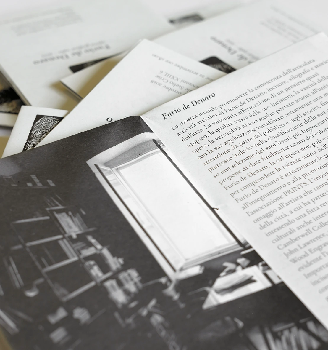
The project required the production of graphic executives for exhibition communication as well as catalog design. The graphic design focused on the choice of two main woodcuts for communication with a strong visual impact: a self-portrait and an English landscape. A typography suited to the style was chosen, a variation of Garamond that was declined in different weights for different applications. The catalog was then carefully designed, leaving space for images and constructing airy page formats for text. The playbill and different graphics were designed accordingly. Strong typography echoing the exhibition title, a strong paragraph and image. The graphics in this case left room for the real content, the artist's artworks to be enhanced.


